Visualizing CSS Specificity
Tough to Grok
Yeah, CSS is a language that many developers (myself included) struggle with. It isn't fun to play with and it often punishes you for so much as looking the wrong way at it. I've been trying to learn what I can about CSS, especially best practices but also the flashy new things that are coming with CSS3. To that end, I read CSS-Tricks religiously and the occasional Smashing Magazine article that peaks my interest. Chris Coyier linked to an interesting article (the subject of this post) a short while back from Harry Roberts on graphing CSS specificity. But enough with the blabbing, let's look at some pictures.
Bring on the Pretty Pictures
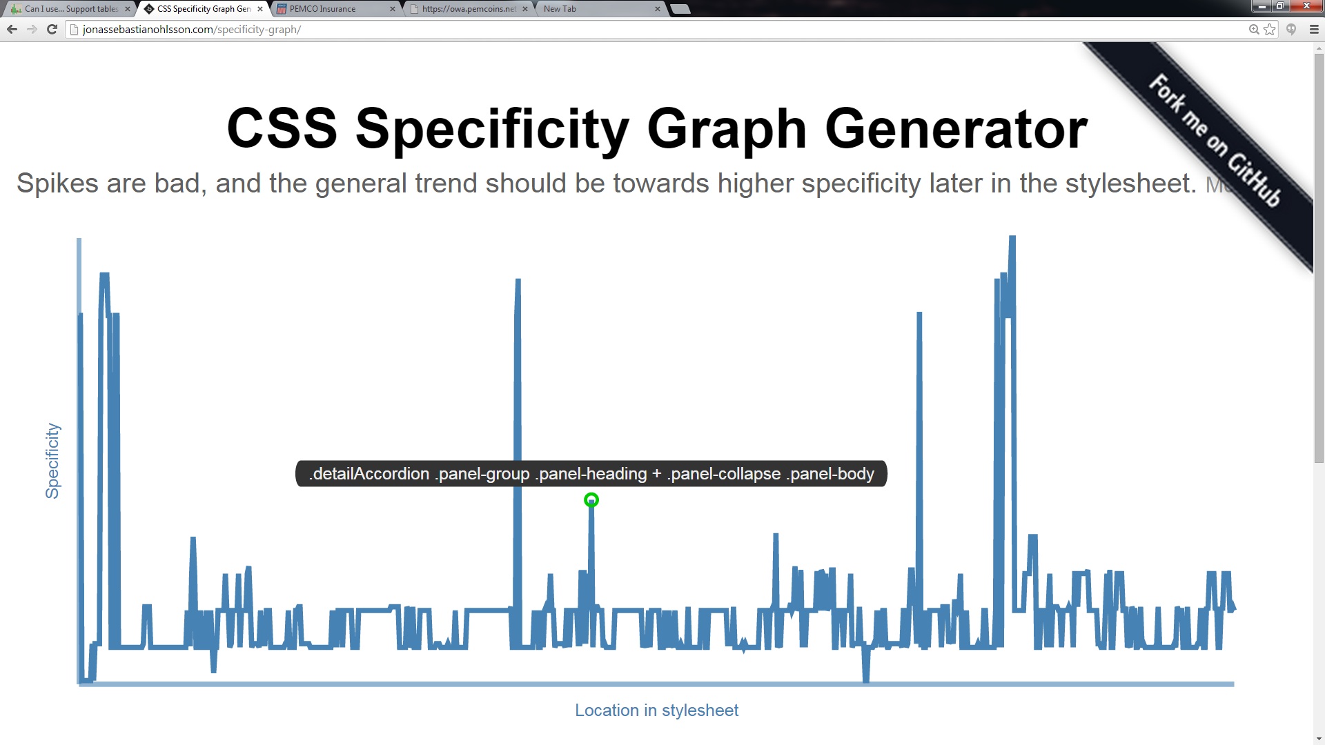
Here's a graph of pemcostyle.css from the Pemco.com home page. The graph is generated from a GitHub project by Jonas Ohlosson.
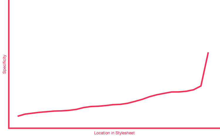
And here's what Harry thinks a good graph looks like (sloping up and to the right) from his blog post.
So, what are we supposed to get out of visualizing a CSS specificity graph? Harry Roberts suggests that a spikey graph indicates a less maintainable codebase. CSS style sheets are challenging to write in part because they always read top to bottom (left to right on the graph) so that a CSS selector that is both at the top of the style sheet and has high specificity will limit our ability to style other elements later in the doc. Overriding such a selector may not be possible or if it is it may require undesirable hacks like !important that make further changes even more challenging. Mis-use of CSS specificity creates a slippery slope.
So Now What
It's always nice to pair a problem with a potential solution. In this case, the suggestion from Harry is two-fold. Reorder you CSS selectors so that low specificity ones come first and high specificity ones come last. Then you should reduce the specificity of your selectors where you can. For example, the selector in the above graphic is from the following snippet:
.detailAccordion .panel-group .panel-heading + .panel-collapse .panel-body {
    border:0px;
}
That's awfully specific just to eliminate the size of the boarder. Instead it might be possible to attach a new class to the markup and use a selector like this:
.no-border {
    border:0px;
}
Or perphaps use BEM syntax like so:
.panel-heading__panel-body--collapsed {
    border:0px;
}
The idea is the same, a single (perhaps wordy) class is prefereable to any combination of classes because it has a lower specificity. And lower specificity leads to increased re-use and decreased frustration extending classes.
For an example of absurdly low specificity in CSS and an elegant solution to a problem check out the lobotimized owl selector.